Category Archives: Anything

Explore Net Worth Rankings by Age (25th to 75th Percentiles)

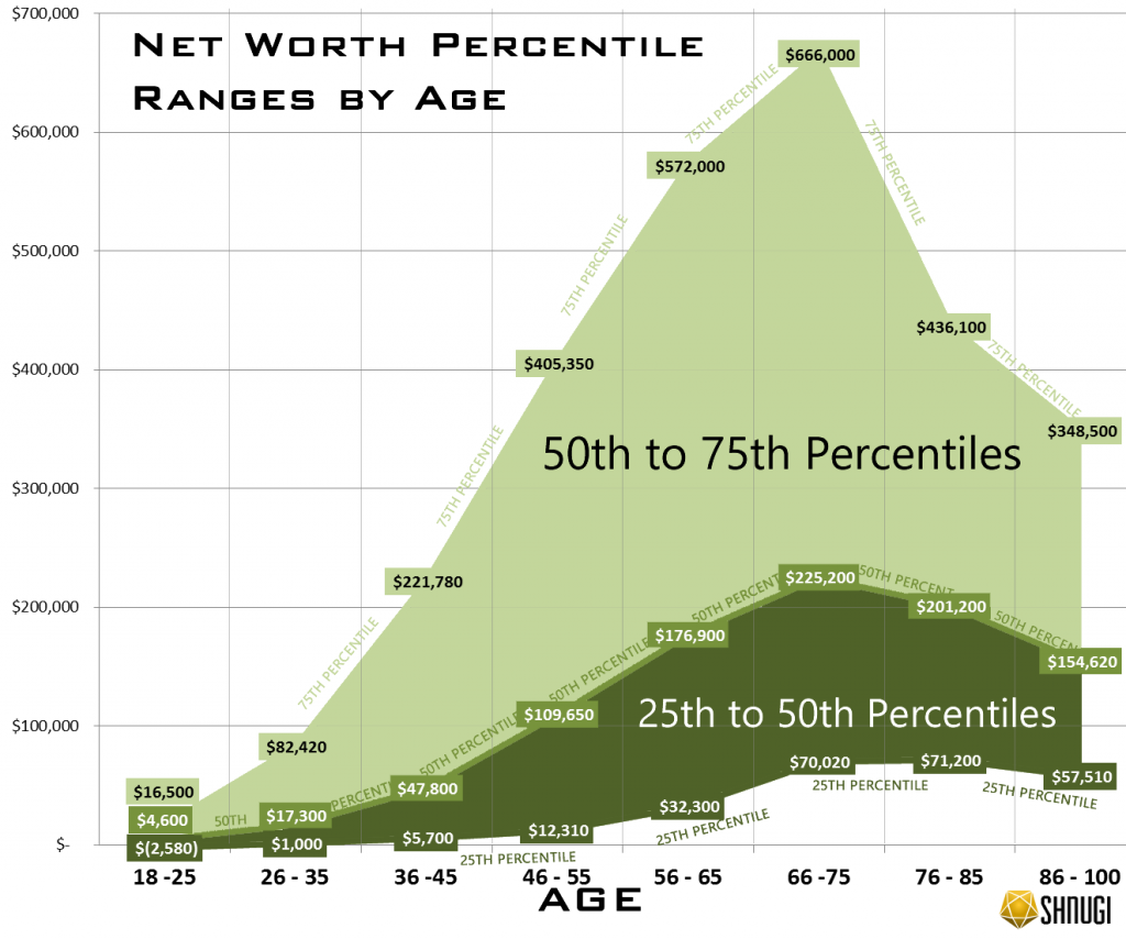
Net worth increases from the 18 -25 age bracket up thru the 66-75 age bracket right around when retirement begins for most people.  In order to be at the 75th percentile in wealth in the 66-75 age bracket, you would need to save roughly $12,000 a year every year since you were 18. After hitting retirement age, net worth for the 25th, 50th and 75th percentiles decline rapidly. The gap between those at the 75th percentile grows to it’s largest at for the 66-75 age group.

Explore the graph, below to see the results visually. Click the graph to expand:

How much do you have to save per year to be in one of those groups?

Age Bracket 25% 50% 75%
18 -25  $      (737)  $            1,314  $    4,714
26 – 35  $          80  $            1,384  $    6,594
36 -45  $        253  $            2,124  $    9,857
46 – 55  $        379  $            3,374  $  12,472
56 – 65  $        760  $            4,162  $  13,459
66 -75  $    1,334  $            4,290  $  12,686
76 – 85  $    1,139  $            3,219  $    6,978
86 – 100  $        767  $            2,062  $    4,647

For example, if you are in the 26-35 age bracket at age 30 and wanted to be in the 75th percentile in wealth, you would need to have saved $6,500 per year since you were 18.

What is a percentile

Percentiles are basically rankings, so that we can do comparisons of different kinds of data. For example, if there were 100 people in the age bracket, the 25 richest people would be in the 75th to 100th percentiles.  The next 25 people by wealth would be in the 50th to 75th percentiles. These people would be above average in wealth, since the person at the 50th percentile is the median (average) wealth. After that the next 25 people would be below the median (average) in wealth at the 25th to 50th percentiles. Finally, the poorest 25 people would be in the 1st to 25th percentiles.

How to read the graph

The light green region represents the net worth’s of people in the 50th – 75th percentiles for each age bracket, who are above average in wealth. The darker green shaded region represents the net worth’s of people in the 25th to 50th percentiles. For each age bracket, there is a label at the 25th, 50th, and 75th marks to label the net worth of people at that age and net worth ranking.

What does this tell us?

For younger Americans, wealth inequality is relatively minor. Those at the 75th percentile for ages 18-25 only have $12,000 more in wealth on average than the median person. This is probably because most of the people in this group are early in their careers, so they haven’t had much time to build up wealth. Across most age brackets, the gap between someone at the 25th percentile compared to the median (50th percentile) is much smaller than the gap between the median and the 75th percentile. This tells us that wealth is concentrated more heavily in the wealthy rather than being more equally distributed. To put that in perspective, the jump to move from the 50th to 51st percentile is larger in dollars than the drop to go from the 50th to 49th.

Unfortunately, this inequality where wealth is unevenly concentrated in the higher percentiles increases with age. It peaks right around when most Americans begin to retire.

Play with the data yourself on the Net Worth Percentile Calculator.  The original data is from the Federal Reserve’s Survey of Consumer Finances.

Change in Manufacturing Jobs by County 1975-2015 [USA]

Watch 40 years of change in manufacturing jobs across the United States from 1975 to 2015. The colors are based on the number of manufacturing jobs in each county as measured by the Bureau of Labor Statistic’s Labor Estimates. Each year (1985, 1995, 2005, and 2015) are compared to 1975 to calculate the percentage change. Green counties have gains in manufacturing jobs.  Red counties have losses.  Counties that are gray have little to no change.

Overall, these 15 counties have seen the largest losses.  Most of these counties were former industrial powerhouses who had distinct advantages in transportation, infrastructure, and energy availability. Those advantages have been rendered obsolete.  Rapid automation and infrastructure improvements in transportation, energy, and communications across the rest of nation have enabled production to spread across the United States as well as overseas.

Top 15 Counties by Largest Losses in Manufacturing Jobs

County 2015 1975 Net Loss
Cook County, Illinois 186,967 666,136 -479,169
Los Angeles County, California 357,554 777,465 -419,911
New York County, New York 27,098 293,745 -266,647
Wayne County, Michigan 88,578 325,077 -236,499
Cuyahoga County, Ohio 69,812 224,160 -154,348
Philadelphia County, Pennsylvania 21,473 164,885 -143,412
Allegheny County, Pennsylvania 36,150 159,353 -123,203
Milwaukee County, Wisconsin 52,495 154,937 -102,442
Kings County, New York 21,174 119,640 -98,466
Hamilton County, Ohio 48,357 134,527 -86,170
Monroe County, New York 40,872 125,510 -84,638
St. Louis City Missouri 17,871 194,998 -77,127
Fairfield County, Connecticut 33,938 108,405 -74,467
Bergen County, New Jersey 30,947 103,631 -72,684
Essex County, New Jersey 16,990 89,462 -72,472

Almost all of these counties are located in the Rust Belt with the exclusion of Los Angeles, County.  Although many of these counties have successfully shifted to new industries in tech and finance, others such as Wayne County have been struggling.

On the other side, counties which have seen the largest increases have not seen increases as large as the decreases in the top 15 counties. Cook County alone had 666k manufacturing jobs in 1975 compared to these counties which had 927k manufacturing job combined in 2015.

Top 15 Counties by Largest Gains in Manufacturing Jobs

County 2015 1975 Net Change
Maricopa County, Arizona 115,385 71,973 43,412
Snohomish County, Washington 63,537 20,588 42,949
San Diego County, California 104,092 71,087 33,005
Elkhart County, Indiana 60,478 31,269 29,209
Harris County, Texas 189,946 161,511 28,435
Washington County, Oregon 47,167 19,747 27,420
Travis County, Texas 40,252 14,568 25,684
Riverside County, California 41,210 18,907 22,303
Ottawa County, Michigan 38,358 17,732 20,626
San Bernardino County, California 53,485 32,871 20,614
Collin County, Texas 23,618 3,705 19,913
Rutherford County, Tennessee 25,301 5,989 19,312
Waukesha County, Wisconsin 43,850 24,896 18,954
Gwinnett County, Georgia 25,246 6,328 18,918
DuPage County, Illinois 55,273 36,416 18,857

Note: Some counties have been excluded from the summary tables due to missing data on some of the reported years.

Historical Chicago Single Family Home Prices (1970-1986)

I was recently exploring some of Robert Shiller’s online data and noticed that he had some historical housing data on Chicago from the 1970s and 1980s.  I was curious what the data looked like after adjusting it for inflation and comparing it to more recent housing prices. Conventional wisdom says that home ownership is one of the best investments that can be made.  This is because it is an investment that you can use on a daily basis on top of being  an asset that could potentially appreciate in value over time.

After adjusting the historical median home prices, median single family home prices were generally between $170,000-200,000 for the 16 year period that Shiller researched (see table below).  According the Chicago Tribune, in early 2016, Chicago single family home prices were roughly $223,000. Taking the inflation adjusted numbers compared to the current housing values, this equals a 0.5% to 1.0% annual inflation adjusted growth rate to property values of single family homes in the city of Chicago, which is in line with previous estimates of home appreciation in the US.

As you can see in the table of the results, the nominal home prices have increased greatly over the past few decades, but the rate of growth over inflation is much smaller than you would have thought given conventional wisdom.

Year  Home Price Nominal Inflation Adjusted (2015) Inflation Adjusted Growth Rate
1970 $29,000.00 $178,930.00 0.489%
1971 $31,000.00 $183,210.00 0.447%
1972 $31,000.00 $177,320.00 0.533%
1973 $34,000.00 $183,260.00 0.467%
1974 $39,000.00 $189,540.00 0.397%
1975 $42,000.00 $186,900.00 0.441%
1976 $44,000.00 $185,240.00 0.476%
1977 $47,500.00 $187,625.00 0.455%
1978 $55,000.00 $201,850.00 0.269%
1979 $62,000.00 $203,980.00 0.248%
1980 $70,000.00 $203,000.00 0.268%
1981 $68,500.00 $180,155.00 0.628%
1982 $73,000.00 $181,040.00 0.632%
1983 $69,900.00 $167,760.00 0.889%
1984 $61,500.00 $141,450.00 1.468%
1985 $74,000.00 $164,280.00 1.019%
1986 $78,500.00 $171,130.00 0.913%


Historical Chicago Home Prices Adjusted to 2015 Inflation

The raw housing data is available on Shiller’s website, and data for Dallas and Atlanta are also available.  The inflation data is from Westegg.

American 30 year old’s wealth also halved in the past decade

The BBC recently reported that Wealth of people in their 30s has ‘halved in a decade’ in the UK.

I ran the numbers for the United States using data from the US Federal Reserve and the results are shockingly similar. Using data from the most recent report from the Federal Reserve, people in their 30s have had a dramatic drop in net worth from $57000 prior to the recession to about $25000 in the years after the recession.  That is drop of over 55%! Even if you compare against numbers from 20 years ago, the wealth of people in their 30s today is half. Among the reasons for this are increased costs of education, reduced earnings, and higher health care costs.

Here is a graph showing the inflation adjusted median net worth trends of households led by 30 year olds every 3 years from 1992 to 2013 (the most recent survey available). All values are in inflation adjusted 2013 dollars.

Tips! Hover over the bars to see the exact amounts.

These trends are telling since this means that the younger generations are not able to build up the same levels of wealth as those who came before them.  With the upcoming election, it is not surprising that the younger generations have been attracted to relative political outsiders such as Bernie Sanders, Gary Johnson and Jill Stein who promise greater opportunities to those who have not seen much of the benefit of the recovering economy.

Looking at the median income for these households, income for these same households has dropped 13%+, since the recession and has not yet recovered. It is not as dramatic as the drop in net worth, but that 13% drop has basically handicapped many young adult households from being able to save.

The data for these charts came from the US Treasury. All of this data is freely available there for you to perform your own analysis and fact checking.

If you would like to play around with the 2013 net worth data, check out the net worth rank calculator. Net worth is defined at total assets minus total debts, including housing, vehicles, cash, investments and retirement accounts.

Who are the 1% by Income? [USA]

TL;DR The households of the 1% by income compared to the normal US households are White, college educated, professionals, work in services and are older.

If you want to become one of this very wealthy group in the future, go to college, get married and become a working professional. Here are some mobile-friendly charts and visualizations to explore the demographics and composition of who makes up the highest income earners in the US are and what they did to get there. Calculate if you are in the 1 percent by income.

Tip! You can hover or click on the graphs for more detailed information.

The households of the 1% have a median income over 22 times as high as median for all US households. This is a tremendously large advantage to these wealthy families to build their net worth.

Looking at their net worth, they are even wealthier at 93 times as much wealth than the median US household. It seems as though the highest income earners are able to save and build a disproportionately large amount of money compared average Americans.

Demographics

Generally, 1%er households are older, with almost none younger than 35 years old.

Compared to overall US population, the head of households of the 1% tend to be much more highly educated. Almost all of the highest income earners in the country have college degrees.

The 1% is overwhelmingly employed in white collared professions. Here’s an explanation in more detail of which jobs fit in which category:

  • White Collar: This category is generally what you would think of as college-educated professionals and managers. Typically these jobs are salaried and based in office environments. It includes jobs such as CEO’s, managers, analysts, computer professionals, scientists, researchers, lawyers, entertainers, educators, doctors, nurses, and other skilled health professionals.
  • Grey Collar: This category is includes technical, sales, and service jobs. Typically, these are hourly jobs that require some formal training, apprenticeships, or specialization. These jobs include front-line supervisors of grey and blue collared employees, clerks, sales people, administrators, agents, food prep, technicians, and operators.
  • Blue Collar: These are hourly workers who are typically not college educated. These jobs typically do not require much as formal training, but it does include many skilled professionals who work in manufacturing settings. This includes production, craft, repair, operational and general laborers. It also includes miscellaneous workers.
  • Not Working: These workers are not employed.

The families of the 1% also tend to be much more likely to be married. Stress over money is one of the major contributors to divorce, so their wealth may help stabilize marriages.

The 1% have a higher percentage of white people than the households of the overall US population. The non-white category includes Hispanics.

The 1% primarily work in non-production based industries. Services & Other includes high income industries such as finance, insurance and real estate (FIRE). Here’s an explanation of the groupings:

  • Production: These are industries that are involved in mining, manufacturing, and construction.
  • Services & Other: These group is basically everything else including transportation, communications, utilities, retail, government, finance, insurance, real estate, etc
  • Not Working: These head of households are not working.

one-percent
Note: The data used to generate these graphs are freely available from the Federal Reserve SCF. There is a known tendency for the SCF to over-sample the ultra-wealthy, such as the 1%, which causes the numbers from the SCF to have higher income and net worth of the 1% compared to other surveys. Use this data for generalizations on the 1%, but keep in mind all sampling of this group are hard due to low response rates.