Category Archives: net worth

Household Savings Improves to only 36% Spending more than Income

After analyzing data from the 2017 Consumer Expenditures Survey (CEX) by the Bureau of Labor Statistics (BLS), nearly 35.9% of US households spent more than they earned. This is the most recently available data from the BLS. Overall, 46 million out of 129 million US households are estimated to have had expenditures that exceeded their after tax income (table below).

Large Improvements since 2015

Comparing these results to the previously reported ones for 2015’s CEX survey where I reported 38.5% spending more than income, the percentage American households saving has improved significantly. Almost 2.5 million fewer households are spending more than they earn, which is a huge improvement. In addition households tended to save more than in 2015, as the $0-$10k group dropped by 1.4 million households, with large increases in households saving larger amounts of income. One of the largest shifts appears in the decline of household who spent more than $150k than they earned. Shockingly, this category decreased 54%! I suspect that the losses of this size were primarily due to investments and housing losses, and values for both of those assets have increased significantly in the past few years.

Continue reading Household Savings Improves to only 36% Spending more than Income

Equifax a record of every pay check I’ve had for 10 years

Equifax has all of my salary history.   It’s all in a 20 page packet detailing each paycheck that I’ve received since I was in college.  Yes, this is the same company that got hacked and leaked practically every Social Security Number to hackers; they also have information that I only thought the IRS had.

I got curious what data Equifax keeps and ran across the Work Number.   Employers–including all of my former employers–send Equifax salary history. Equifax takes this data and sells it to other companies who want to verify your income thru a service called the Work Number. You can request your own free report at the Work Number online, thru mail, or via phone. I couldn’t figure out how to use the website–not surprised that their IT infrastructure isn’t super updated.  So I printed the PDF and mailed them a letter. The report arrived a couple weeks later.

What’s in a Work Number Report

The report is broken out into three parts. The first details an overview with an introduction and record of who has requested a report in the last 24 months.  The second part is a record of your income history; mine was especially detailed.  The third is a bunch of stuff on the terms and how to correct the records if they’re wrong.

My data has been provided three times to two companies (Credit Karma and Chase) over the past 2 years.  This is what is looks like:

Work Number Report requestors

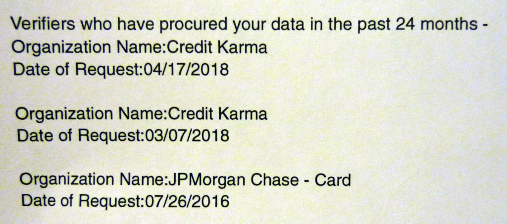
It’s not entirely clear to me what employers or creditors can and can’t see if they request the report.  I’ve never logged into the Work Number website to get a pin, but I must have clicked a button or signed off somewhere to give Credit Karma and Chase access to my data. That means whenever you agree to a background check by a potential employer, creditor, or landlord you could be also giving them permission to access your pay records that the Work Number sells.

Every pay check is listed in detail

The next 17 pages were a record of my employment history. It lists a gross and net record of each and every pay stub I have ever received as an adult.  The layout and information that is includes varies a little bit by employer, according to the Work Number each employer owns the data so they decide what they send.  My current employer has a pretty typical layout:

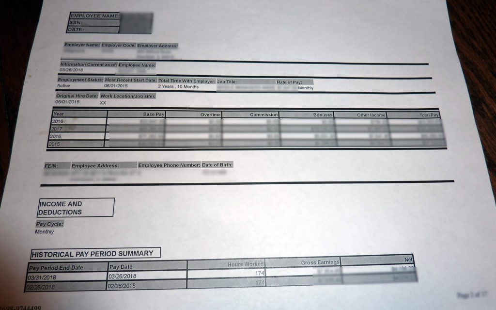
At the top you have employer info, role information, start and end dates.  Next is an annual summary of my income.  Then comes the unexpected part of a listing of every paycheck with the net and gross income. It is 100% accurate.  In fact, I think that these records are far more thorough and complete than anything I personally have been recording for the past 10 years.  When I requested the report, I never expected that this level of detail was being sent to and recorded by 3rd parties.

The report just goes on and on after this. Some of my former employers reported information about insurance, specific with-holdings.  Also, at least one employer only listed out my cumulative annual pay, but that was for an internship.

Be careful what you share

I see a lot of job search advice that says to fudge salary history, so that you can ensure that you get a raise for jumping ship, but keep in mind that this information is available and out there.  If you lie about what your compensation was at a previous employer, you could be found out.  So be careful with what you agree to, because your records are out there for companies who are willing to pay for it.

This report is 100% free, so I would definitely recommend requesting it at least once just to see what is in your file.

Calculating my Savings Rate with the Swan FIRE Prowess

I recently came across a new metric, the Green Swan’s FIRE Prowess Score, to measure my progress in achieving financial independence / early retirement. It’s an interesting twist on a savings rate calculation. Like many savings rate metrics, it is tied to your gross income (pre-tax), but the amount that you save is your change in net worth.

The Formula

It is calculated as:

Annual Change in Net Worth ($)
Annual Gross Income ($)

The thing I like about this formula is that is builds in a measure that combines your gross income with your net worth growth.  The ratio takes into account growth in equities and retirement. For more specifics on the basic thoughts read TGS’s article about it.

Comparison of Savings Rates

To show the difference between this metric and a regular savings rate, I’ve created a  couple rough scenarios and tables using a theoretical person who has these stats:

  • Savings rate of 10%, 20%, 30%, or 40% every year for up to 40 years of working
  • Annual equity growth on savings of 7%
  • Annual income growth rate of 2.5%

I really like to benchmark how I’m doing versus a goal, which is why I made this. The assumptions are pretty crude, but I think for a general goal this is good.

Swan FIRE Score by Savings Rate
Swan FIRE Score by Savings Rate and years of working.

As you can see in the graph over time, the person’s Swan score continues to scale even though their savings rate is steady.  I think it really demonstrates compounding growth and the importance of earlier savings versus later savings. Here’s a link to the spreadsheet I used so that you can play around with some of the assumptions Swan FIRE Score by Savings Rate.

My Score vs the Standard Savings Rates

I’ve been working 6 years after college so far, and my usual results vary between 0.41 and has grown to 0.71 for my project year ending score. My lifetime rate has been 0.54. [Update as of 2022 I’m at about 0.7 but 2021 had me at 0.8. It’s too bad the stock market hit a big bump.] I’m using some data pieced together from the Social Security Administration on how much I earned each year, and then my net worth readings are from end of year. According to TGS, my score is good and will bring me on the track to FIRE eventually. I’ve decided that my target comparison rate is with the 40% savings rate scenario.

My Swan score vs the theoretical goals.

As you can see in the graph, my performance has been at or above that rate for the past 7 years. Full disclosure, my actual savings rate varies between 40% to 50%, but I like to sand bag my goals. In addition, the last 6 years looks great partially because of the booming stock market. But let’s say this was 2008, the metric would be depressingly negative. I think overall this is a good metric, because it definitely gives some standards to reach for. I’ll probably keep a log updated every now and then with this score.

Read Related Posts

A few other bloggers are also running related posts on topic, so we all got together to post at the same time. This way you can get a diverse perspective on it.

Edit: 4/2/2023, wow what a different world it was back when I wrote this. The landscape of personal finance bloggers has changed a lot, and it looks like the Green Swan shut down and their domain got scooped, so I’ve switched out a couple to archive.org links. So sad to see over half the gang going to dead links now, but I’m keeping their ratios for historical purposes.

  1. Anchor: The Green Swan – The Swan’s FIRE Prowess Gauge 2016: the one who started it all. 132% Lifetime: 93% (ARCHIVE)
  2. the Retirement Manifesto – Is Your Wealth Building On Track?. A big thanks to Retirement Manifesto for setting this up! 2016: 57% Lifetime: 44%
  3. OthalaFehu – My Swan FIRE Prowess Numbers Othalafehu has 10 years of personal data including the recession. 2016: 72% Lifetime: 61%
  4. Budget On A Stick – My FIRE Prowess Score 2016: 52% Lifetime: 55%
  5. DadsDollarsDebts: DDD’s FIRE Prowess Score 2016: 26% Lifetime 32%
  6. Debts To Riches – My FIRE Prowess Report Card 2016: 29% Lifetime 43%
  7. Adventure Rich – The Adventure Rich FIRE Prowess Score 2016: 45% Lifetime 47%
  8. Freedom Is Groovy – The Groovies FIRE Prowess Score 2016: 163% Lifetime 90%
  9. Working Optional – Calculate Your Progress To Financial Freedom 2016: 97% Lifetime 75%
  10. Life Zemplified – FIRE Prowess Score for Life Zemplified 2016: 78% Lifetime 76%
  11. Physician’s Wealth Services – Physician Wealth’s FIRE Prowess 2016: 43% Lifetime 46%
  12. Married And Harried – Married And Harried FIRE Prowess Score 2016: 32% Lifetime 14%
  13. Ms. Liz Money Matters – Introducing the FIRE Prowess Score 2016 279% Lifetime 72%
  14. Actuary On Fire: The Swan’s FIRE Prowess Gauge – My Results 2016 61% Lifetime 59%
  15. Budgets Are Sexy – My Total Lifetime Wealth Ratio: 2016: 135% Lifetime 60%
  16. Trail to FI: FIRE Prowess Score, Trail to FI Edition 2016: 34% Lifetime: 53%
  17. Maximum Cents: Maximum Cents’ FIRE Prowess Score 2016: 94% Lifetime: 70%
  18. Retiring On My Terms: ROMT’s FIRE Prowess 2016: 119% Lifetime: 57%
  19. Minafi: The Minafi FIRE Prowess Score 2016: 74% Lifetime: 94%
  20. Military Dollar: FIRE Prowess Scores & How to Correct for Military Paychecks 2016 81% Lifetime 83%
  21. Finance Yo Self: FIRE Prowess Score for Finance Yo Self 2016: 44% Lifetime: 44%
  22. The 7 Circles: FIRE Prowess Gauge 2016: 246% Lifetime: 219%
  23. Money Metagame: The Good, Bad & Ugly of the FIRE Prowess Gauge 2016: 108% Lifetime 68%

Don’t risk your entire retirement on a hunch.

Here is a cautionary tale of why you should be careful when trying to out fox the stock market. Last week, many people risked their life savings betting everything that Rite-Aid’s stock would shoot up from $3.50 all the way up to the $6.50 / share that Walgreens was offering. If the merger were to happen Walgreens would pay the $6.50 for every share of Rite-Aid stock–nearly a 100% gain. People were betting that the Republican-led FTC would approve the merger, and allow the 2 companies to create the nation’s largest drugstore chain.    Don’t let your greed blind you though. There was a reason that Rite-Aid’s stock was so far below the offer price–the deal was unlikely to pass the regulators.

Turns out Walgreens decided to pull out of the deal last Thursday, and Rite-Aid stock has since dropped to $2.50.   Here are 2 Wall street better’s who went all in.

“The Insider”

This gentleman is a part-time pharmacist at Rite Aid. The internal emails that he received gave him confidence to make a bet on the merger going thru. This probably was not a great decision, since any information disclosed to the front-line workers on the merger were probably also released to the general public via the FTC, SEC or their investor relations website. The stock market reacted to all that information by valuing Rite-Aid far far below the offer price.

He made a nearly $200,000 bet on this. From his original purchase price of $3.20 he has lost nearly 22% in the past week.

Thankfully, he’s a pharmacist so he’ll probably survive despite this bad move.

The $125k YOLO

He bet $125,000 on a hunch at $3.83 / share. With the current share price of $2.50, he has lost over one third of his investment. That equals $42,000, more than the annual incomes of many Americans.


Both of these investors made posts regretting their decisions. I think that it’s important to remember that if something seems too good to be true, it’s probably going to screw you over so be careful. These 2 investors purchased shares with no options to buffer their potential losses. If you’re going to make a life changing decision like betting hundreds of thousands of dollars on a single stock trade, you should probably try to cover your self with some kind of downside protection like a professional investor would.

Net worth of the middle class from 1992 – 2013

One recurring request for the net worth percentile calculator on this website to show a break down of what makes up that net worth value. Here it is for a typical middle class household!

Here are the results of that request for a typical middle class household with comparisons for the past 20 years.  The overall trend for the shows that net worth has increased slightly, but assets and debts have also increased at almost the same rate.

Housing is by far the largest contributor to middle class wealth with investments contributing a far lower amount. In 2013, real estate contributed 54% of net worth ($110k in real estate assets – $64k in real estate related loans).

Net worth peaked in 2007 prior to the recession, and as of 2013 has not recovered yet. The 2016 data should be available over the summer in a few months, so we’ll see if the downward trend continues.

Net Worth Component Definitions

  • Real Estate : House(s) and other real estate
  • Investments : Retirement funds, stocks, mutual funds, stock options
  • Low Risk Investments : Cash, bonds, CD’s, and cash value of life insurance
  • Other Assets : Cars and other assets
  • Real Estate Debt : Mortgages and other real estate related loans
  • Student Loans and Auto Loans : These were already combined in the source data as installment loans.
  • Credit Cards and Other Debt : Credit cards and other debt

The data is sourced from the Federal Reserve and all values are adjusted for inflation to 2013 dollars.  The 2016 data will be published over the summer and I am planning to update the calculators and this chart to show additional trends.

We used the data for the 40-60th percentiles to create a weighted average net worth of what makes up the wealth of an average household, and to represent the middle class. Because it is a weighted average (mean), the net worth values are skewed slightly higher than a median based calculation.

Summary Table of Net Worth for the Middle Class

Note: these values are adjusted for inflation into 2013 dollars.

Year Total Assets Total Debt Median Net Worth
1992 $131,000 ($48,603) $82,397
1995 $152,434 ($63,897) $88,537
1998 $171,146 ($67,091) $104,054
2001 $185,715 ($68,590) $117,125
2004 $213,655 ($93,009) $120,646
2007 $250,588 ($111,403) $139,185
2010 $185,185 ($97,994) $87,191
2013 $161,126 ($76,052) $85,074

If the graph doesn’t load here is an image: